I recently delivered a presentation of our (outcome-based) roadmap. Several people approached me after the presentation to tell me that they found it useful and informative, so I thought I’d jot down some of the things that I think contributed to the warm reception of the presentation. Hopefully, these tips will come in handy both for others and for my future self.
Organize by outcome, then by persona
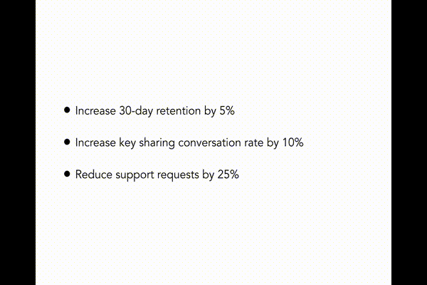
A corollary to the “outcomes, not output” way of thinking is that features should be grouped and presented according to the outcomes we hope those features will achieve. One of the opening slides of my presentation simply outlined (with three short bullets) outcomes. Once you’ve grouped features by outcome, then subdivide into groups according to a persona. This makes it easier for the team to see why the presented features matter and to see them as merely one possible solution to the problems we’re attempting to solve for particular users.
Use Animations for “Signposting”
Signposting is a standard presentation technique that you probably remember from you college speech class, but in case you forgot: it’s anything that helps listeners know what has been discussed and what will be discussed next.
When using a presentation tool, we can use animations to facilitate signposting. In my case, I found it helpful to include animations that showed a transition from one outcome to another and from one persona to another. They looked like this:
Introduce Personas with Quotes
In my case, the personas I discussed in the presentation were fairly new to the team, so to introduce each persona, I included a few quotations from interactions I’ve had with users that fit that persona. A simple quote slide with a picture representing the user persona seemed to work well here:

Include an indication of priority
Since you aren’t organizing your presentation by the order in which the features will be completed, the team will need some way of understanding the relative importance of the features you’re discussing. In my case, grouping the features into different numbered buckets that indicated their relative importance and including an icon of that numbered bucket in the corner of a feature slide seemed to do the trick. It looked like this:
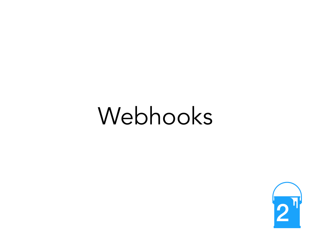
Features with the “2” buckets, for example, were more important than features with a “3” bucket.
Include and strategically place “hooks” (or Don’t be boring)
Hooks draw your listeners back into your presentation, and they are discussed extensively in the excellent book Brain Rules. Since our brains tend to wander, you need a hook at least every 10 minutes1, and you should open with one. What makes a good hook?
Images are always helpful, but specific types of images make good hooks. The human brain is hard-wired to pay special attention to
- Things it can eat
- Things it’s seen before
- Things that have emotional content2
Well-known pieces of art often make good hooks since they often check two of these boxes at once. Of course, you’ll have to do a little work to use the image as a metaphor for the point you’re making, but the work is worth it.
Quoting your team members is another effective hook. At the very least, you’ll have the attention of one person in the audience.