If you’ve ever looked at analytics for software products, you’ve probably run across a graph that looks like this:
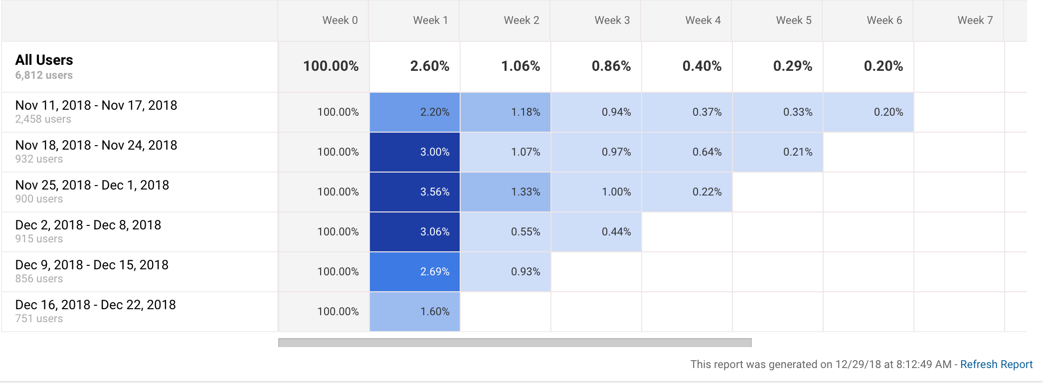
Graphs like this one depict cohort analyses.1 This particular graph is from Google Analytics. Apple also has one for app analytics. So does Fabric.2
Cohort analyses can be very useful. For example, Eric Reis, in The Lean Startup, recounts how cohort analysis helped his startup realize that their efforts at improving their product weren’t working:
Thanks to the power of cohort analysis, we could not blame this failure on…external market conditions, or any other excuse. Each cohort represented an independent report card and try as we might, we were getting straight C’s.3
Although cohort analyses are often useful, they’re definitely not perfect ways of tracking progress in product development.4 They can lead us to think there’s progress where there is none and to think that we’re not making progress when we actually are. They can also obscure the relationship between product changes and conversion rates.
Sometimes this is fine. We aren’t always looking for perfect inferences that our product changes are driving better metrics. Sometimes we just settle for evidence that suggests the inference.5 But, if we’re looking for solid inferences, traditional cohort analyses can fall short.
In what follows, I’d like to explain why this can happen and how we can improve cohort analyses to avoid these shortcomings. Here’s the gist: cohorts aren’t true experiments because the users between cohorts and the product itself may be too different to confidently infer that product changes drove results over time. We can fix this issue by doing split testing within cohorts and by ensuring that product changes aren’t seen by cohorts that are older than the changes.
Avoiding Cohort Differences as Confounding Variables
Let’s take another look at the cohort analysis above:
Notice that the November 18th cohort has better week 1 retention than the previous cohort and that the November 25th cohort has even better week 1 retention than the November 18th one.
Now, suppose that the cohorts correspond to product iterations; we released version 1 for the November 18th cohort, version 2 from the November 25th cohort, etc. Cohort analysis is supposed to help us answer the question: did we improve our product with these iterations? (If the percent difference between week 1 and week 2 isn’t big enough in your mind, just make it bigger. It’s just an example.6)
Since collecting and analyzing cohorts usage isn’t truly a controlled experiment, we can only say that product changes are associated with increases in week 1 retention. It could turn out that our product release just happens to be timed with another variable that explains the up-tick in week 1 retention.
If we were working on a fitness app, for example, the up-tick might be explained by the fact that on cohort was active closer to the holidays when they were thinking more about a fitness related new year’s resolution. The difference between earlier and later cohorts (a difference ultimately driven by time of year) is a confounding variable that could lead us into thinking we have improved the product when we haven’t.
Here’s a more colorful example: PayPal was originally targeting palm pilot users and wound up serving a customer segment they didn’t originally target: eBay sellers.7 Imagine what would happen if PayPal was looking at a cohort analysis right around the time eBay sellers discovered PayPal and started using it. If they weren’t careful, they’d think that their product efforts were leading to increased engagement, when in fact the increased engagement would be driven by the fact that the users in the later cohorts belong to an entirely different customer segment. Again, the difference between cohorts would be a confounding variable here.8
So far, so obvious. I don’t think this point is at all earth-shattering, but I did want to try to clearly explain it so that I can motivate a different way of doing cohort analyses that isn’t susceptible to this issue. Let’s look at that now.
To avoid the possibility of cohort differences misleading us about how effective our “improvements” are, we can do split testing within cohorts. Version 2 of the fitness app, for example, would only be given to half of the users within the next cohort. If the users who were given version 2 in that cohort have much better (statistically significant) 1-week retention than the users who are still using version 1 of the app, then we can be confident that our product changes are in fact responsible for the improved retention.
This isn’t an original idea at all9, but I haven’t seen anyone propose expressing the results of split tests within cohort analysis charts. Instead of showing the raw retention metrics in the boxes of the cohort chart, we’d show the ratio of the experimental group retention to the control group retention. It could look like this:
| Cohorts | Week 0 | Week 1 |
|---|---|---|
| 1 | 1 | 1 |
| 2 | 1 | 1.1 |
Let’s look at these boxes one at a time.
| Cohorts | Week 0 | Week 1 |
|---|---|---|
| 1 | 1 | 1 |
| 2 | 1 | 1.1 |
They key box is at (cohort 2, week 1) and it shows that the experimental group had a 10% better 1-week retention than the control group.
| Cohorts | Week 0 | Week 1 |
|---|---|---|
| 1 | 1 | 1 |
| 2 | 1 | 1.1 |
This chart also shows that the product changes for cohort 2 didn’t have any impact on retention during the first week (week 0) because the ratio in the (cohort 2, week 0) box is 1.
| Cohorts | Week 0 | Week 1 |
|---|---|---|
| 1 | 1 | 1 |
| 2 | 1 | 1.1 |
More trivially, it also shows that product changes didn’t affect week-1 retention for cohort 1 because the product changes for cohort 2 were introduced after the first week had passed.
Avoiding Product Differences as Confounding Variables
In order to see another problem with traditional cohort analyses, let’s assume we’ve got another couple weeks of data and add columns for those weeks to our chart:
| Cohorts | Week 0 | Week 1 | Week 2 | Week 3 |
|---|---|---|---|---|
| 1 | 1 | 1 | ??? | ??? |
| 2 | 1 | 1.1 | 1 |
What should we put for the values at (cohort 1, week 2) and (cohor 1, week 3)? In normal cohort analysis charts, cohort 1 would have the changes introduced for cohort 2 during week 1, so the impact of those changes would show up in the value for these boxes. I think this can be a mistake. This section explains why.
Ignore what value should go at (cohort 1, week 2) for a second. Instead, let’s think about what should go in (cohort 1, week 3).
Let’s say that the changes we introduced for cohort 2 simplify the user interface by only highlighting features we think will bring users back for the next week of use. Of course, when some features are highlighted, other features will be less prominent and it could turn out that those features drive retention for week 3.
If cohort 1 sees the changes introduced for cohort 2, how could we know whether our new design trades 1-week retention for 3-week retention? We couldn’t. We would only see the 3-week retention for cohort 1 based on the version of the product introduced for cohort 2 and we’d have nothing to compare that retention rate against. The difference in the product introduced during week 1 is itself a confounding variable here.
Let’s look at another example. Consider a sample cohort analysis of Reddit’s engagement funnel10:
| Cohorts | Visit | Return Visit | Active Account | Active Voter |
|---|---|---|---|---|
| Jan | - | - | - | - |
| Feb | - | - | - | - |
| Mar | - | - | - | - |
| Apr | - | - | - | - |
Suppose that in February, we introduce changes aimed at increasing the conversion rate between visitors and return visitors. If the January cohort sees the changes introduced for February, we won’t know the impact those changes had on active account and active voter behaviors. We won’t know, for example, if we’ve traded off a better visit to return visit conversion rate for a worse active-account to active-voter conversion rate.
Not all products will have this potential problem, but I suspect its quite common. The issue of product differences as confounding variables arises when the time it takes to put out a new iteration is less than the time it takes for users to fall through an engagement funnel.
To avoid this problem, we can make sure that cohorts don’t see the changes that are newer than the cohort. This is like A/B testing in that users from different will see different versions of the site/app. Its unlike typical A/B testing in that it’s more permanent and far-reaching. I think “deep A/B testing” is a pretty good name for it. Cohort 1 sees version A of the site in perpetuity because we don’t always know immediately how version A vs. version B affects downstream behaviors.
We’re now finally in a position to fill in the ???s in the above cohort analysis chart from our simple example of weekly retention.
| Cohorts | Week 0 | Week 1 | Week 2 | Week 3 |
|---|---|---|---|---|
| 1 | 1 | 1 | 1 | 1 |
| 2 | 1 | 1.1 | 1 |
We replaced the question marks with a 1 because cohort 1 won’t see changes for cohort 2 that week and cohort 1 isn’t split-tested at all because its running version 1 of the site in perpetuity. Of course, this means that the first row of this chart isn’t going to useful. Since the values in the chart are ratios of experimental group metrics to control group metrics, all the values are going to be 1, so we can drop row 1 entirely.
Conclusion
Split-testing cohorts and deep A/B testing may not always be feasible, and even when they’re feasible, they may not be worth the additional extra effort. Sometimes its fine if we settle for less than perfect knowledge about results of our product experiments. However, in situations where we need to be more careful about the inferences we’re making from product iterations, I think we’ll be better served by using this helpful cohort analysis.
Notes
-
This is actually a cohort analysis of weekly retention on my blog. Apparently, my writing isn’t that interesting. 😉 ↩︎
-
Fabric’s graph looks a little different and it only tracks retention, but its still a cohort analysis. ↩︎
-
Eric Reis, The Lean Startup, 140-141. ↩︎
-
I suspect this is probably pretty well understood by many people, but frankly, I wasn’t one of those people until recently. Maybe I’m not alone. ↩︎
-
Marty Cagan makes this point in his book Inspired. I think as more software products are introduced and competition increases, its going to become more important that we tighten up how we make inferences about whether product changes are actual improvements. ↩︎
-
If you feel like the difference between week 1 engagement needs to be larger to be “statistically significant,” your worry is misplaced. There’s no chance that there’s sampling error involved in this cohort analysis because the entire population of users during a period is what makes up a cohort, so we don’t have to worry about statistical significance. ↩︎
-
Keith Rabois, a former PayPal exec, talks about this in his Y-combinator lecture on how to operate. ↩︎
-
With both of these examples, you could argue that we’re likely to figure out that there’s a confounding variable eventually. The problem with this argument is that waiting to find this out can take a long time and you’re wasting effort and operating with bad assumptions until you figure this out. ↩︎
-
Eric Reis talks about how Grockit, a social learning startup who was eventually acquired by Kaplan, did this in The Lean Startup on pgs 151-152. ↩︎
-
The idea to use reddit’s cohort analysis as an example came from Lean Analytics, pg. 130-131. ↩︎